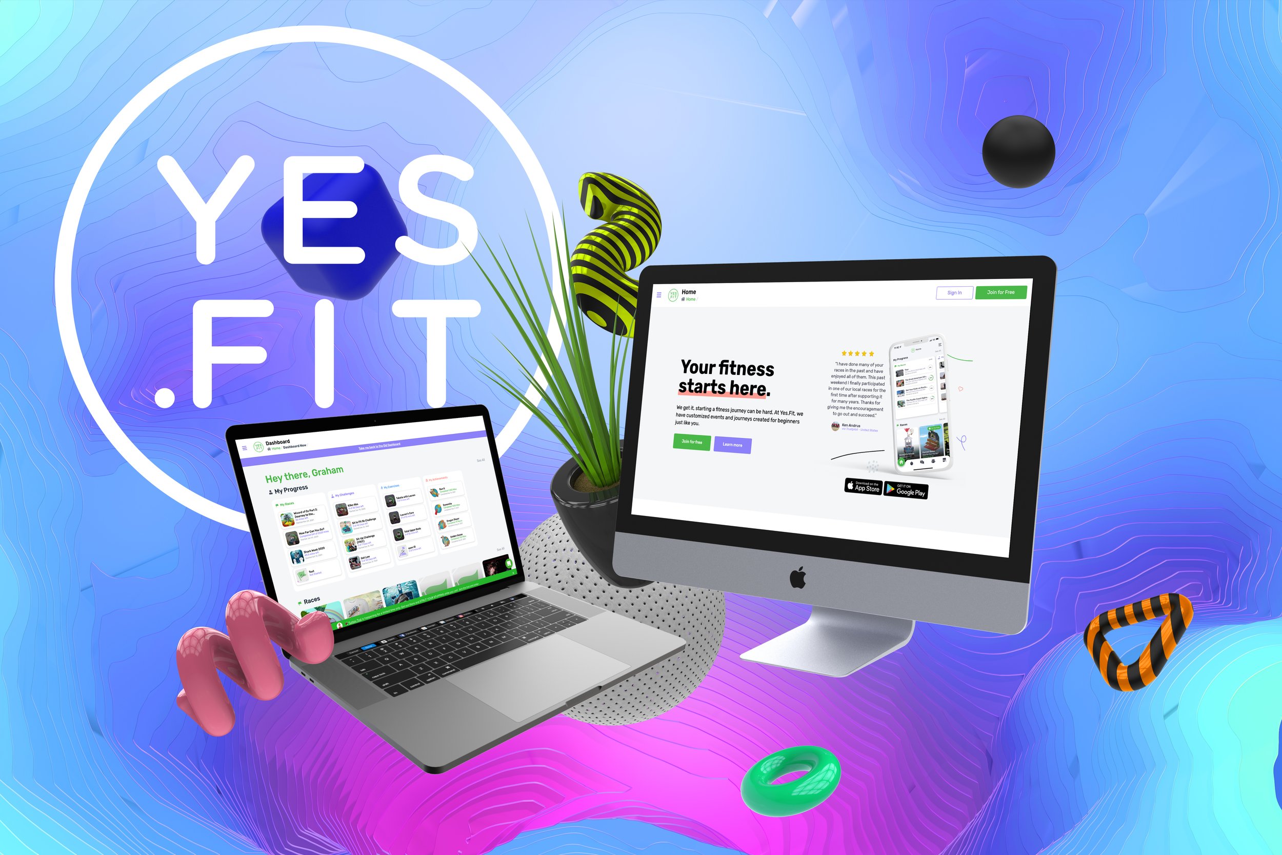
Yes,Fit Website - 2021
About the Project
Shortly after a complete design overhaul of the mobile app, I was tasked with freshening up the website. Of course, by freshening up, that meant change every page, the whole design, a new UI library and again, the use of Figma, to make this vision come to life. It was a challenge I was relishing and couldn’t wait to start the process.
My role also included improving our calls-to-action, imagery, and user interactions. We looked at user feedback on some of the pain points through Heap analytics and Hotjar to analyze issues that our customers would speak about the most.
https://www.yes.fit
Yes.Fit Website Before and After
Legacy Yes.Fit Homepage - 2019
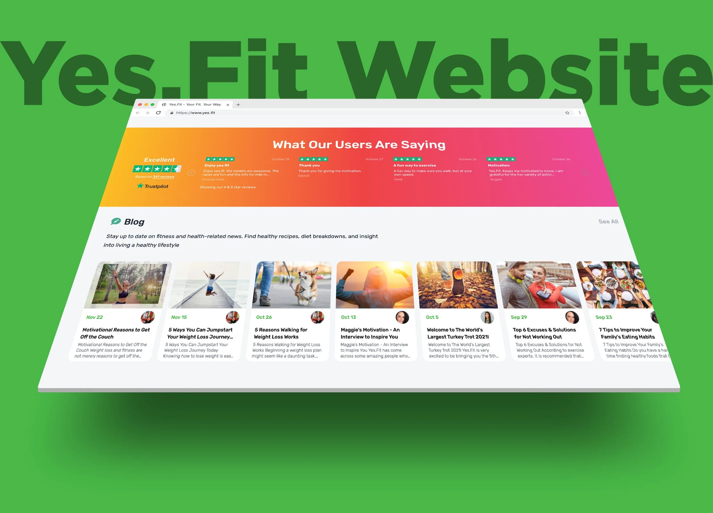
New Yes.Fit Homepage - 2021
Updated Yes.Fit New Dashboard - 2021
In the beginning…
After spending countless hours in Figma to create mockups and prototypes for the mobile app, I continued my relationship with this awesome interface design tool to begin the new look for the website. We new we wanted a complete overhaul and down the road, allow the marketing department to update copy and photos. The plan and vision for the new site was sketched out via whiteboard to ensure we all still understood the flow and navigation. I suggested implementing a new tool for usability testing as well as one for product analytics. With the combination of Maze and Heap, we were able to assess what was working well and what was failing miserably on the soon to be legacy website.
The Problem
Our existing website was outdated and was not cohesive with our new mobile application. After hours of meetings and collaboration with the Dev/Engineering team, we decided that building the new website with React, Next.JS and Tailwind UI would give us every resource and performance enhancer we were seeking. Our existing side shared a codebase with the old react native mobile app so we needed to spin up a whole new repo.
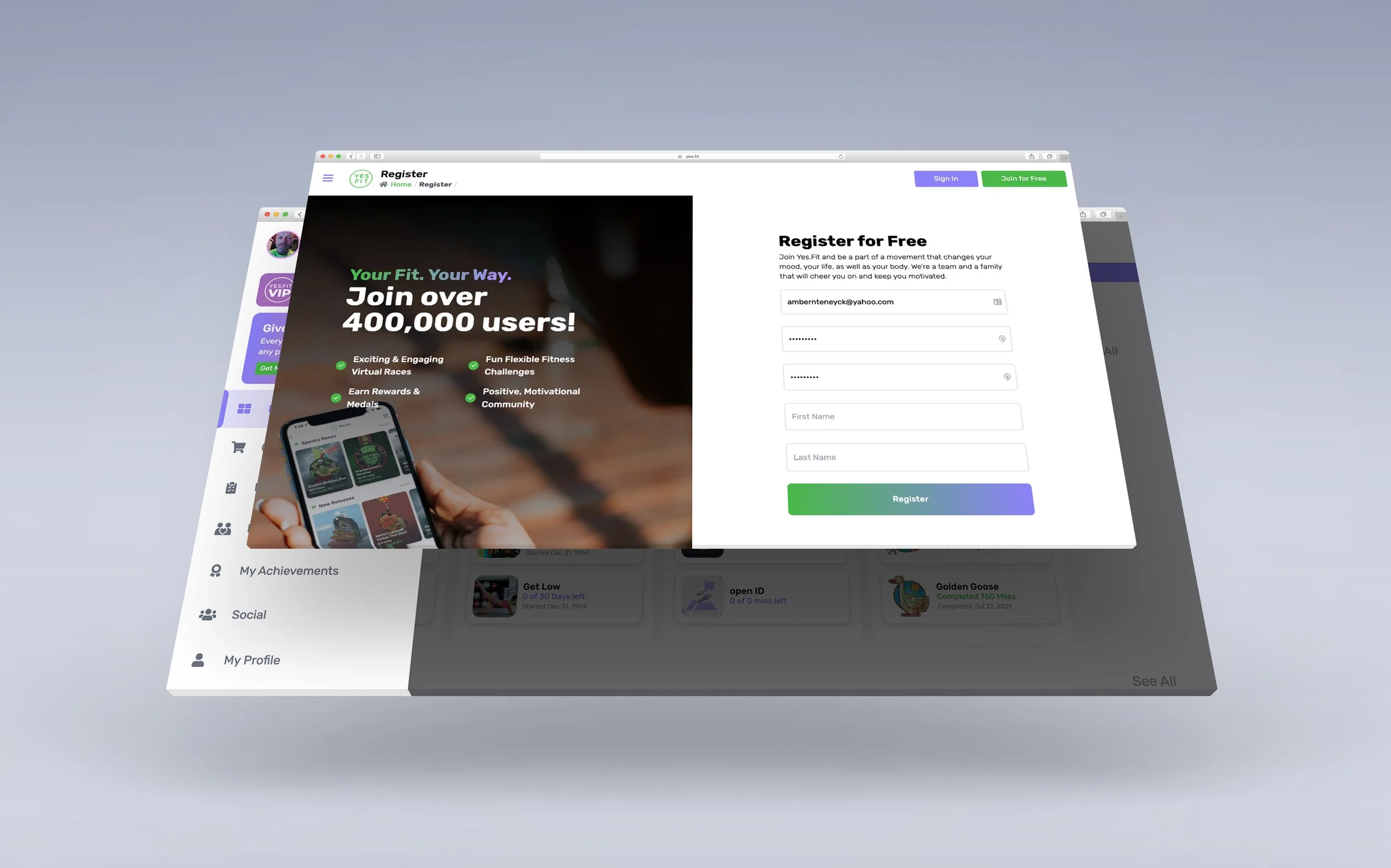
We ultimately decided that tackling the homepage screen for both a logged in and non-logged in user would be the appropriate starting point. After that, we wanted a complete redesign of the user dashboard where our customers consume their metrics and check-in on their in progress events. These were some of the highest traffic areas on the existing site so improving the look and feel was pertinent.
Our calls-to-action seemed weak along with really explaining right away to our users what Yes.Fit was about and what we did. We also felt the Dashboard for the existing user was cluttered, confusing and really lacked a comprehensive snapshot on how they were performing.
Understanding User Expectations
Surveys
Surveys are a fantastic tool for gaining user feedback in an effort to improve the overall user experience. We took the time to survey members of the Yes.Fit community to gain data insight and focus on the new key features of the website.
Video Recordings
With the installation of Hotjar, I was able to watch hours of real user interactions on the old website. This allowed me to pinpoint confusions, mis-clicks, and bugs and in turn, improve the new design and flow in every facet.
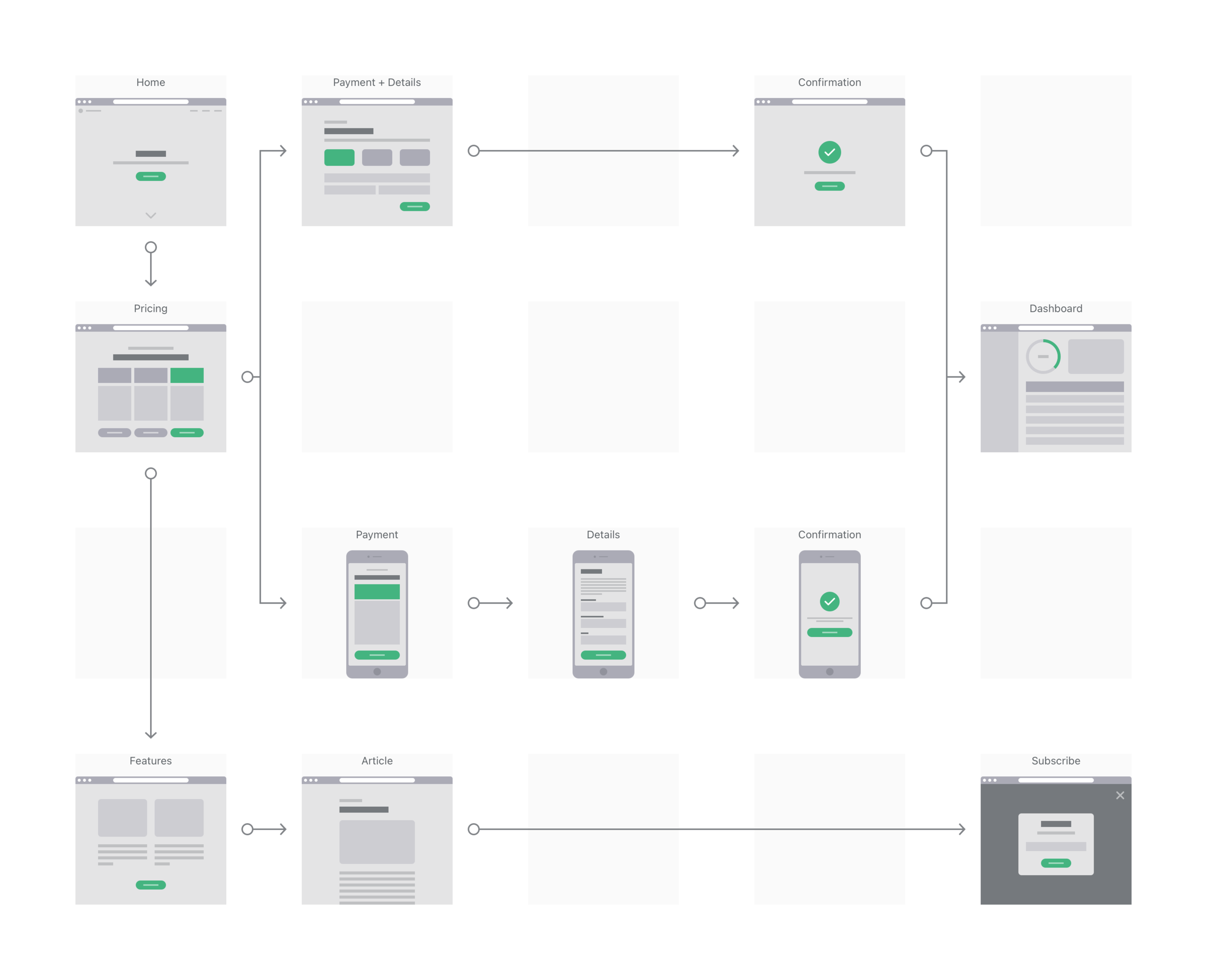
Start with a plan. Let’s wireframe.
Since the majority of this site functions as a marketing tool to drive people to the mobile app, I wanted to ensure that we could quickly construct beautiful landing pages and layouts that would catch the eye of the user and be perfectly responsive.
Through discussion with the team, we decided Tailwind UI would give us exactly what we needed. I began wireframes to demonstrate some of these new layouts that would ideally generate more conversions and user sign-ups.
Researching calls-to-action, attention grabbing copy, and engaging photography were all things that were on the forefront of my mind, but starting with the shell of these things was step one.
All-New Sitemap
With the addition of both Exercises and Challenges, I needed a clear understanding of all the new pages and the true hierarchy within the new site.
A point of user feedback was they were finding it difficult to quickly view their personal fitness content. I decided to update the main navigation to include a much needed “My Stuff” section that was content tailored to the user that was logged in. This allowed them to quickly navigate to the items that mattered most to them.
Understanding the flow of the user meant constructing a detailed journey map.
This would later prove invaluable when determining the user states we would need the engineers to comprehend. It got quite complicated figuring out what components, what pages, and what data our athletes would see based on their logged in state and if they were VIP members or not.
Next comes cohesion.
I then began focusing on making the full user experience from mobile app to web as seamless as possible. Allowing the user to navigate throughout the web pages and find what they are looking for in an intuitive and easy manner was my main focus.
Again, our demographic is middle aged woman who tend to stray away from strictly using a mobile app on their phone to view and consume content. However, after some data analysis, we realized that 90% of our current users were viewing our website on a mobile device.
This meant that I needed to take a mobile-first approach to this new design and highlight the features and flow we desired in a clean, concise fashion. We thought about how to both convert new users but also how our current users could benefit from an easier UI and new fitness stats that give them insight to their performance.
We are currently working on implementing every feature from the mobile app into the website and will get there soon.
Focus on Features - Membership
A major aspect of our overall platform that we wanted to improve was registrations and VIP membership enrollments. We ultimately thrive on subscription based user involvement and this required a revamp of the membership purchasing screen.
The CPO and myself proposed a new approach to the tiered membership by offering monthly, quarterly, and yearly membership options. This allowed for a clearer understanding from a user standpoint and allowed them to receive a hefty discount by paying for the year upfront. We did some research on the success of this model and it has certainly paid off with the number of VIP Memberships steadily rising month-to-month.