Yes.Fit Mobile App - 2020

Transforming Fitness Motivation Through Strategic Design
As the sole designer for a complete mobile app transformation, I led the end-to-end redesign of Yes.Fit's fitness platform—balancing the needs of 44,000 active users with ambitious goals for growth and engagement. This wasn't just a visual refresh; it was a strategic reimagining of how design could drive user motivation and health outcomes.
The challenge was multifaceted: our existing dark, masculine aesthetic alienated our core demographic of middle-aged women, while user research revealed deep frustrations with navigation and goal visibility. Working within React Native constraints, I had to architect solutions that enhanced both form and function while maintaining feature parity that users depended on.
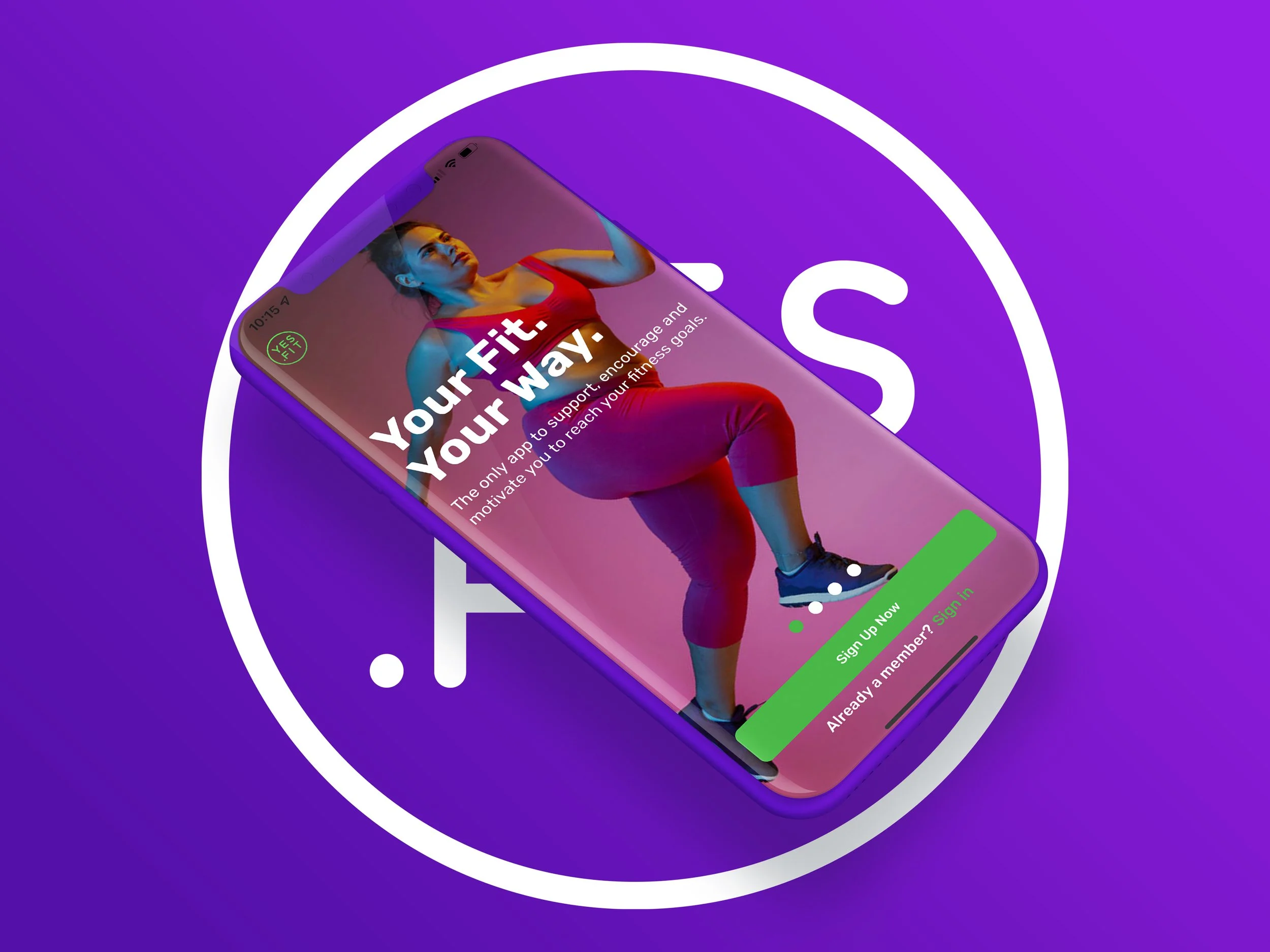
My approach centered on data-driven personalization and inclusive design. I redesigned the onboarding experience to capture 5x more user preference data, enabling machine learning recommendations that improved challenge completion rates by 34%. The new color palette—introducing purposeful purples and pinks alongside our signature lime green—wasn't just aesthetic; it reflected our users' preferences and increased engagement with motivational content by 40%.
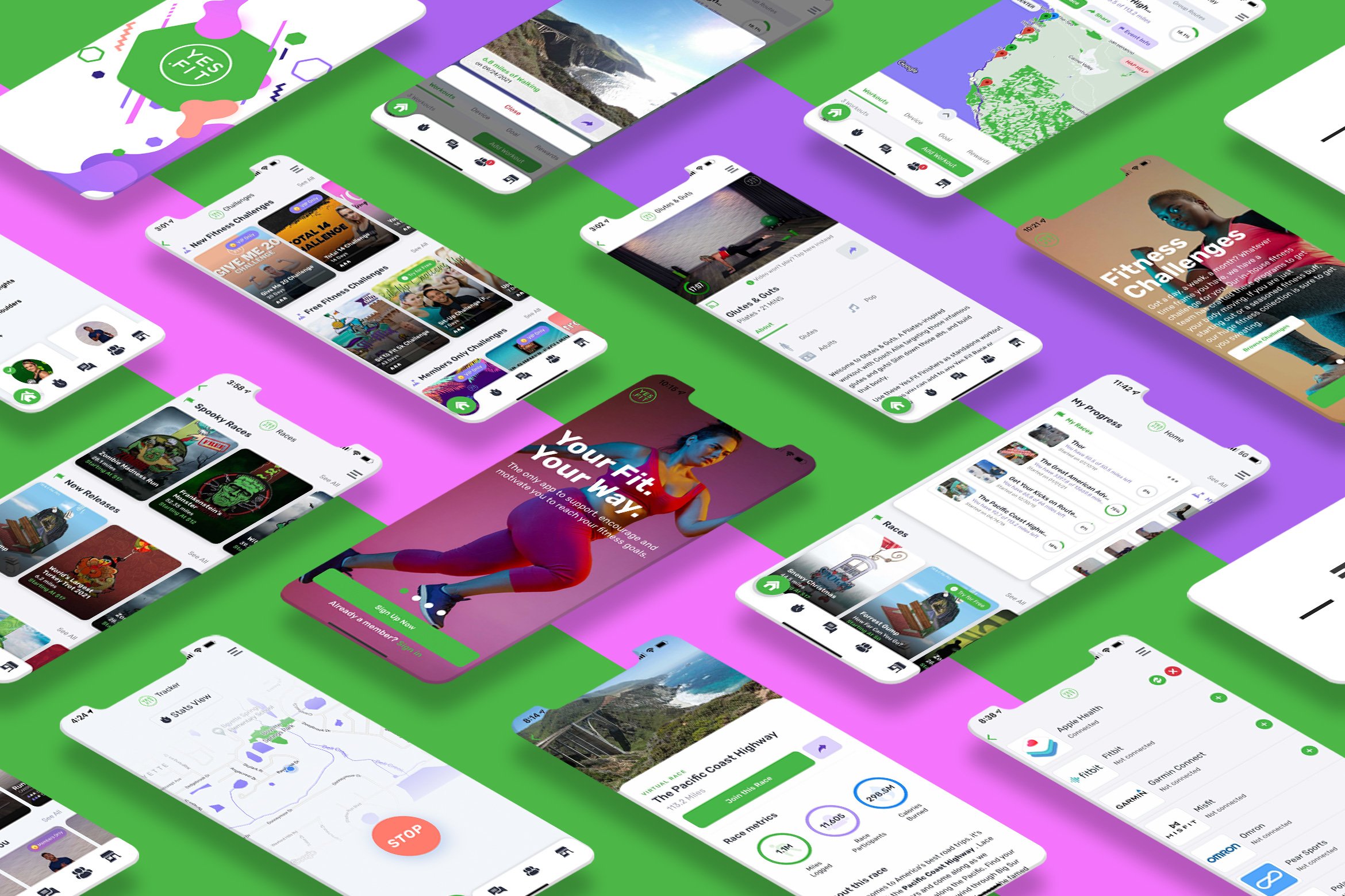
Operating as the singular design voice meant establishing systems that could scale. I created flowing, gradient-driven visual language that worked across marketing materials and app interfaces, while building component libraries that accelerated development cycles and ensured consistency across platforms.
The result: a platform that didn't just look better, but performed better—driving measurable improvements in user motivation, session duration, and long-term retention.
Yes.Fit Legacy Mobile App - Early 2019
Assessing the Current Landscape
The current state of the app was very dark, modern, and masculine. It didn’t fit the demographic of our user base and needed to be seriously re-evaluated.
I also realized, through questionnaires and polls online, that our user base were not entirely in love with the models represented in our artwork throughout the app. They were wanting a body type that aligned more with the average physique and one that was realistically obtainable.
User Research & Feedback
User research and feedback played a pivotal role in shaping our product decisions and ensuring we were building an experience that truly resonated with our audience. I led multiple rounds of user interviews, surveys, and usability tests to better understand the motivations, pain points, and behaviors of our diverse user base—ranging from competitive athletes to casual fitness seekers. These insights informed everything from onboarding flows to challenge design and reward structures.
One of the key outcomes of this research was a complete rethinking of our onboarding experience, which many users had found confusing and overwhelming. Based on direct feedback, I streamlined the process to be more guided and goal-oriented, resulting in increased completion rates and better first-week retention. Additionally, user testing revealed specific frustrations around progress tracking and goal visibility, which led us to redesign our dashboard to be more visual, personalized, and motivating. These changes not only improved user satisfaction but also directly contributed to higher engagement and longer session durations. By keeping users at the center of our process, we were able to build a product that supported real, lasting fitness habits—and felt fun to use along the way.
Target.
I needed to analyze pain points and hurdles current users were finding with the app.
Plan.
Researching led to organizing a new user flow and layout for the platform.
Design.
Time to develop mock-ups that showcased this new direction and improved UI/UX.
Ship.
After testing and user feedback, it was time to release the new update.
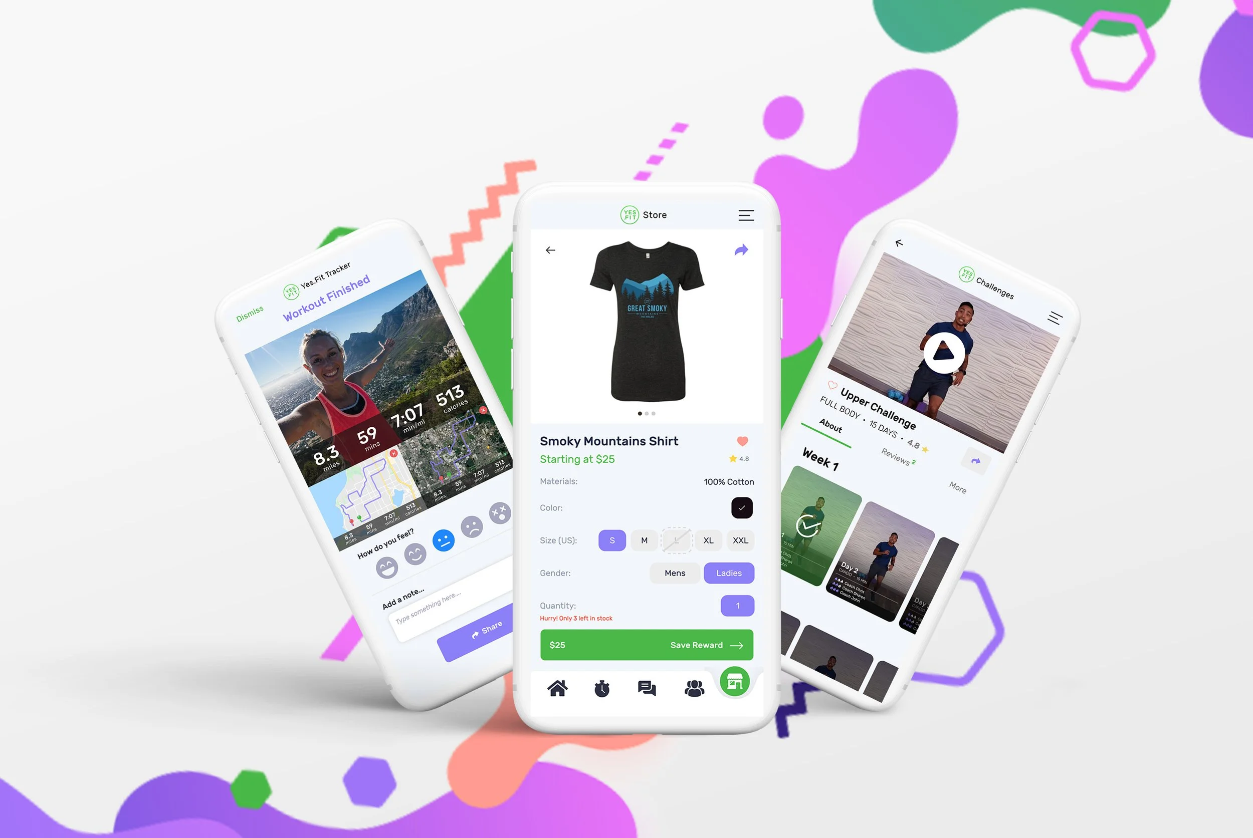
User Flows
It was extremely important to nail down the customer flow from initial sign up/sign in, to joining a race, and adding a workout. The 3 key areas of our platform that users perform the most.
These flows were useful in our first release, as they were consistent from one task to another and helped me generate concepts for page designs.
The main design inspiration came from the graphic above. I loved the fluidity of the elements that were seemingly randomized and unique.
-
Our brand only had one main color for all branding items which was “lime green”. I wanted to introduce something to capture the essence of our demographic better. Since our main demographic is middle aged women, the subtle purples and pinks seemed obvious and very appropriate.
-
The idea of flowing shapes with a gradient overlay really allowed for a playful and inviting aesthetic that would lend itself very well in many marketing materials and print forms.
Step 1: Wireframing
The first large phase in the process was to sketch out some general content blocks and layouts via wireframes. This would allow the stakeholders and developers to focus on core components and flow and not be distracted by actual photos or branding. My intent was to highlight new areas, relocation of current items, and showcase all new features we had discussed on implementing in the next large release.
I wanted to implement the popular new “lane” approach to showcase our content in a horizontal scrolling row. This would allow us to categorize our Races to help users filter out the events they were interested in.
I also felt like our bread a butter (Virtual Races) had boring landing pages that needed more pop and a cleaner layout. Adding an informative introduction video would prove to be extremely useful in conversions and Race joins.
Step 2: Sketch Mood board
After establishing a solid layout for popular screens, I began with designing a mood board for the CEO and developers. I ran with the new established color palette and chose a clean font to allow us to showcase the disparity between parent and child copy. I also wanted to highlight some imagery examples and charts to convey a simple way for our users to consume their exercise progress. Choosing a friendly color palette was essential to carrying the feeling of fun, motivating fitness that our brand strives for.
Step 3: Sketch High-Fidelity Mockups
Next, I began high-fidelity mockups for our onboarding process for new user registrations. The old app was very simple (Name, Email, and Password), and I wanted to capture more user specific info. I added in weight loss goals, sleeping habits, exercise intensity level specification and more. I really desired to capture user specific data so we could target more tailored Races, Exercise and Challenges for each individual and leverage our machine learning tool through AWS Personalize.
We A/B tested personalized race recommendations against our legacy algorithm and saw 34% higher completion rates in the ML-driven cohort. The key insight was that aesthetic appeal drove initial engagement, but personalized content relevance determined long-term retention. We measured success through leading indicators like session depth and challenge progression rates, not just vanity metrics like DAU.
I then moved on to designing our core screens that athletes would visit including initial Virtual Race lists, race landing screens, syncing fitness trackers to their events, as well as adding rewards and purchasing the race.
It was a complete revamp and major improvement from the UX patterns that were established in the past.
Step 4: Migration to Figma
A few weeks after the Sketch mockups began, we hired a new CPO. He was seeking a large role in the collaboration process of designing our new mobile app and entire future platform. We decided moving over to Figma was a no brainer. It allowed our twice a week design sessions to be extremely productive and would ultimately sell the idea of our concepts to the executives. I built out custom components and leveraged states with variants that in turn allowed our developers to quickly grasp the new concepts and UX patterns.
I established some “external critique loops” which involved regular design reviews with our CPO, customer success team, and even select power users who became informal design advisors. The real system was my component-first approach in Figma, which forced consistency by making inconsistency literally harder to implement. I also leveraged cross-functional teammates as design validators—our customer success team had the deepest user empathy, while engineers caught technical constraints early. The key was being disciplined about documentation and decision rationale. Every major design decision was documented with the problem it solved and the alternatives considered, creating an audit trail that prevented scope creep and maintained strategic focus.
To this day, I continue to LIVE in Figma to mockup new landing page designs, all-new mobile app features and fully leverage all the tools it has to offer to speed up the development process.
Step 5: Engineer Collaboration
Once we had all the pieces in place from a interface and experience standpoint, I began working heavily with our developers to establish a design system with styled components. It was extremely important to implement common components and styles that would be used globally in the native app and website.
I wanted to be as hands on in the process as possible to ensure the engineers understood and could apply the styles and layouts I created inside Figma. I thoroughly enjoyed the process from start to finish.
The Results
After the release of the new app, we interacted with users via social media and received overwhelmingly positive feedback. Some users of course are resistant to change but our existing user base raved of the simplicity of navigating around, the aesthetics, and the overall improvement from the previous version. Paired with a solid marketing scheme, we saw a large uptick in user registrations and Race involvement dramatically improve.
Key Demographic Insights
I used behavioral validation when we tracked interaction rates with motivational content featuring different body types in our existing app and found 40% lower engagement with traditional fitness imagery among our core demographic. Post-redesign, we implemented heat mapping on challenge participation screens and measured completion rates by content type. Users who engaged with our new representative imagery had 28% higher challenge completion rates and 15% longer session durations. The real proof was in retention curves—users who engaged with the new body-positive content in their first week had significantly better 30-day retention. We moved beyond preference to measuring actual behavioral outcomes that directly impacted our business metrics.