Creating a Social Reading Experience That Engages & Retains
A social app where readers connect, discover meaningful conversations, and feel at home even before their network grows.
CONTEXT
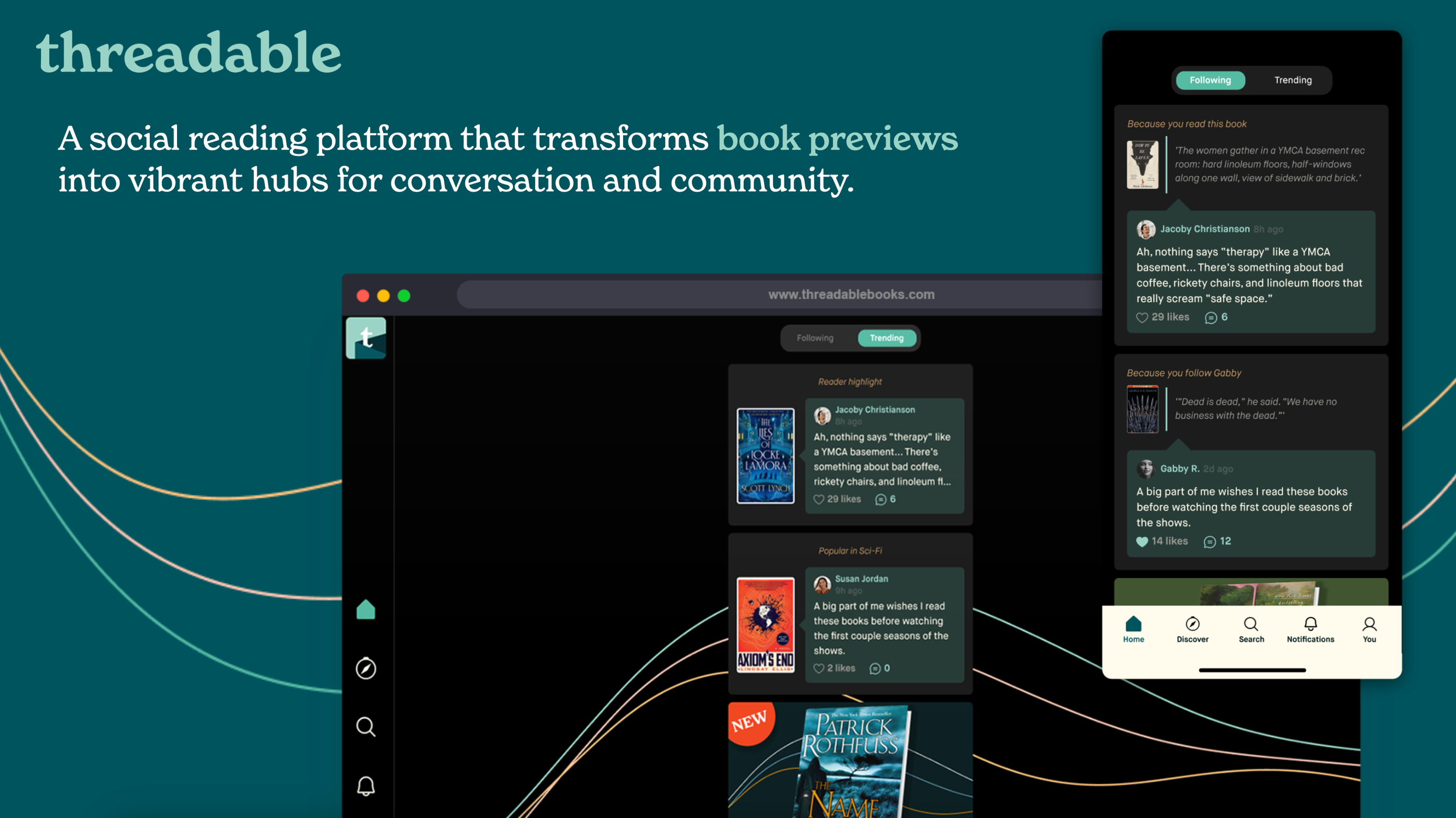
Threadable Books set out to be more than just another reading tracker. The vision was to create a social space where readers could share insights, discover new books, and connect with a like-minded community. The challenge: new users weren’t finding value quickly enough, engagement was inconsistent, and the visual identity felt disjointed across touchpoints.
My Role:
Lead Product Designer, responsible for UX/UI design, user research, and building a design system for the product and brand.
Discover
To understand where the product was falling short, I:
Conducted a UX audit and mapped existing user flows.
Interviewed readers, influencers, and casual users to capture motivations and frustrations.
Analyzed usage data to pinpoint drop-off during onboarding and engagement dips post-signup.
Key insights:
Onboarding was long and front-loaded with steps that didn’t provide immediate value.
The “cold start” problem left users disengaged when they had few social connections.
Visual inconsistency across app and marketing weakened trust.
Users wanted authentic community features, not just book ratings.
Key Findings
From research:
Onboarding was overwhelming; too many steps before users saw value.
Users had little incentive to stick around when they didn’t yet have social connections — the “cold start” problem.
Inconsistent brand visuals and UI patterns across app + marketing eroded trust and made navigation confusing.
Strong demand for community features: readers wanted meaningful conversations, not just rating books.
Personas Defined
To help shape design decisions, I defined three user archetypes:
The Curator — loves visual storytelling, sharing book aesthetics and quotes
The Critic — values depth; wants detailed analysis, reviews, nuanced discussions
The Community Builder — thrives in collaborative spaces; values user interaction
These personas guided which features to prioritize and how to design flows.
My Impact Was Clear
Within the first six months of relaunching the redesigned app and website, Threadable saw a 60% increase in active users, a 40% boost in user engagement, and a 25% improvement in user retention. We implemented rigorous measurement through feature-flagged releases and cohort analysis. We also tracked micro-conversions—book additions, profile completions, first social interactions—all showing significant improvement tied to specific UI changes I designed.
The engagement boost was directly tied to three specific design improvements I led:
The new book scoring interface increased rating completion by 67%
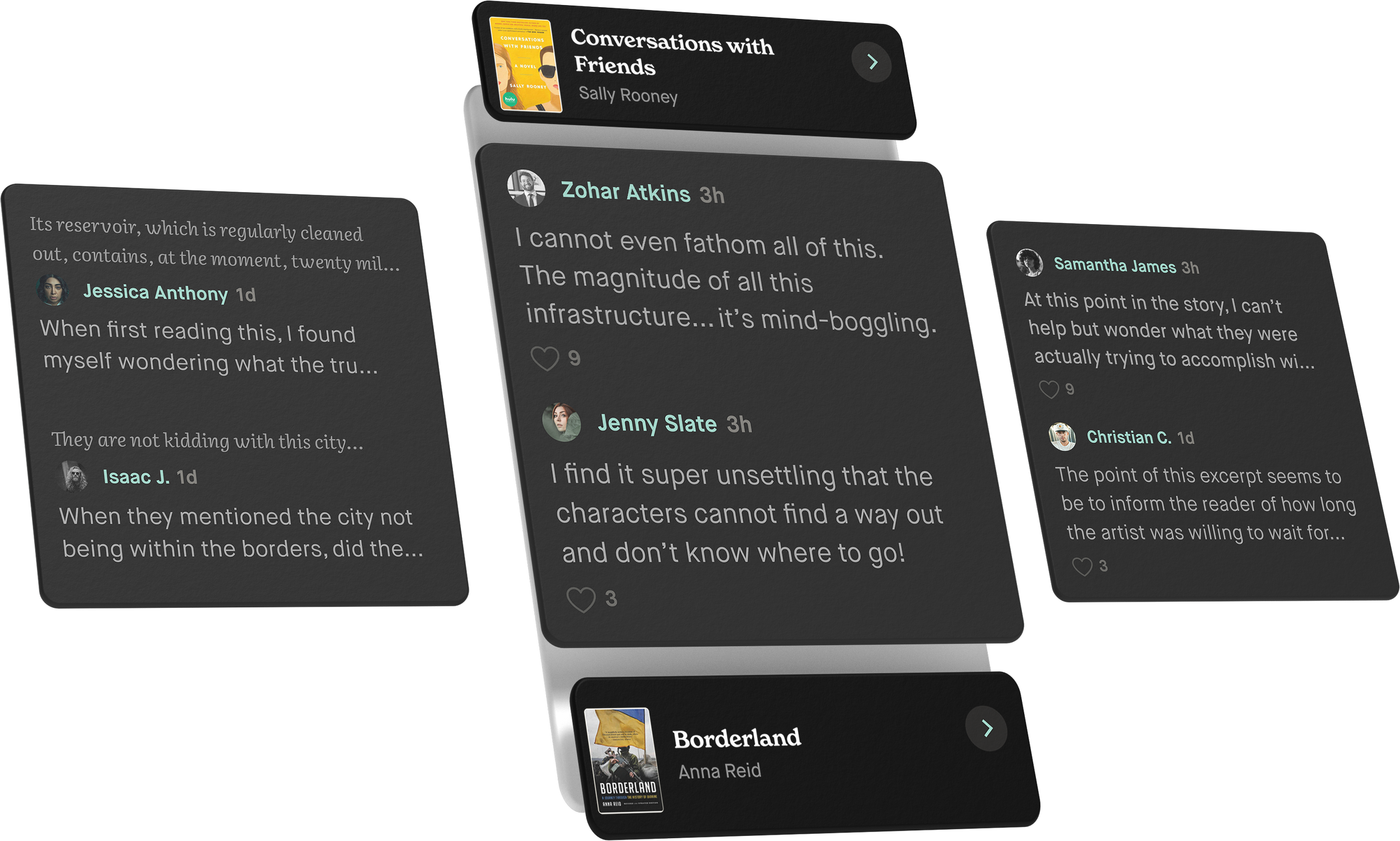
The redesigned community features doubled comment engagement
Our streamlined onboarding reduced drop-off
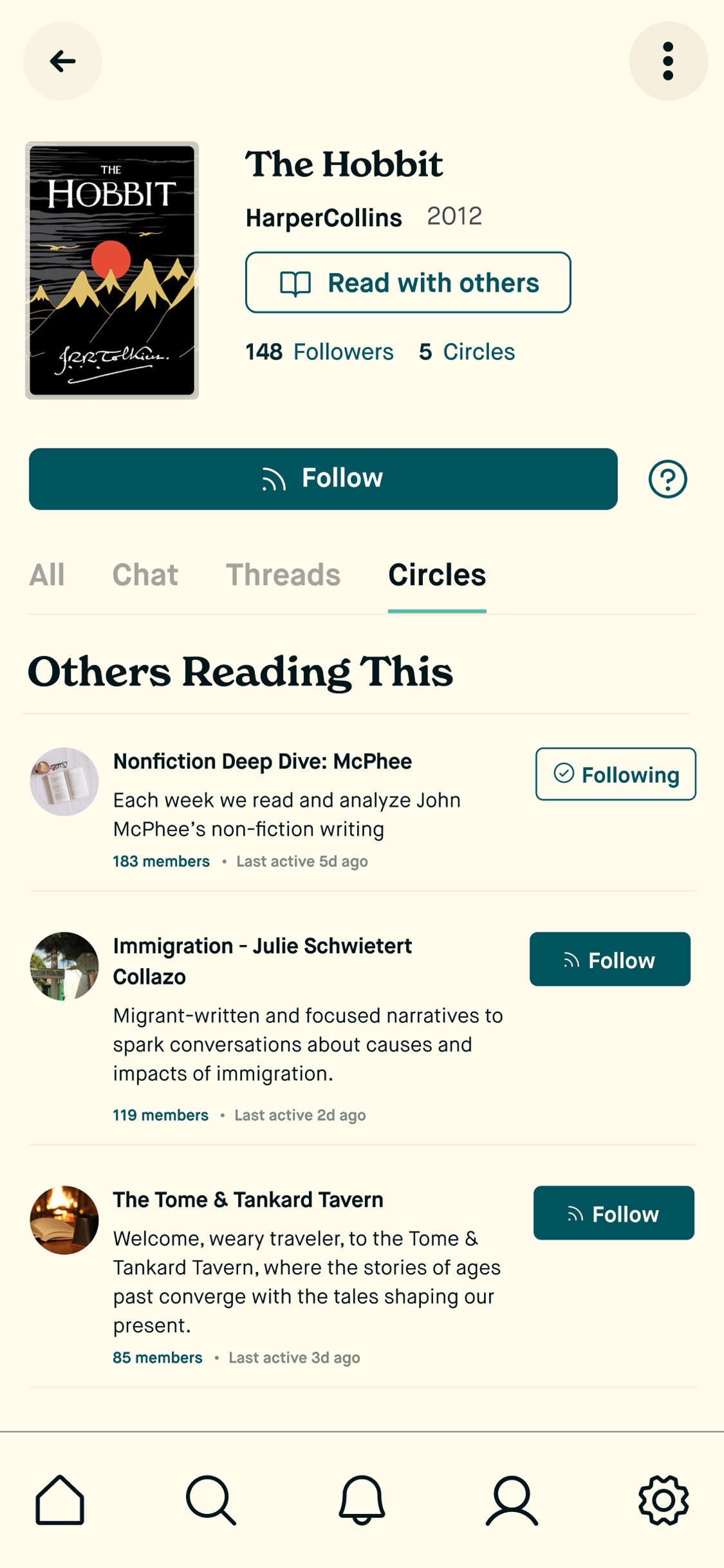
The fundamental challenge was creating social value before network density. Most reading apps fail because they require massive user bases to feel social. I designed what I called "ambient social proof"—showing reading activity and ratings from the broader community even when users had few connections.
We solved cold start through algorithmic curation. I designed UI that surfaced relevant discussions and readers based on book preferences, not just social graphs. The engagement metrics reflected this: users with fewer than 5 connections still showed 34% higher retention when exposed to community-generated content. The key insight was designing social features that provided value immediately, not just at scale.
Define
From this research, I shaped the problem:
How might we help new users quickly see the value of Threadable Books while creating a cohesive, scalable design system that supports long-term engagement?
Design goals:
Reduce friction in onboarding.
Surface community content early.
Create a unified brand and design system.
-
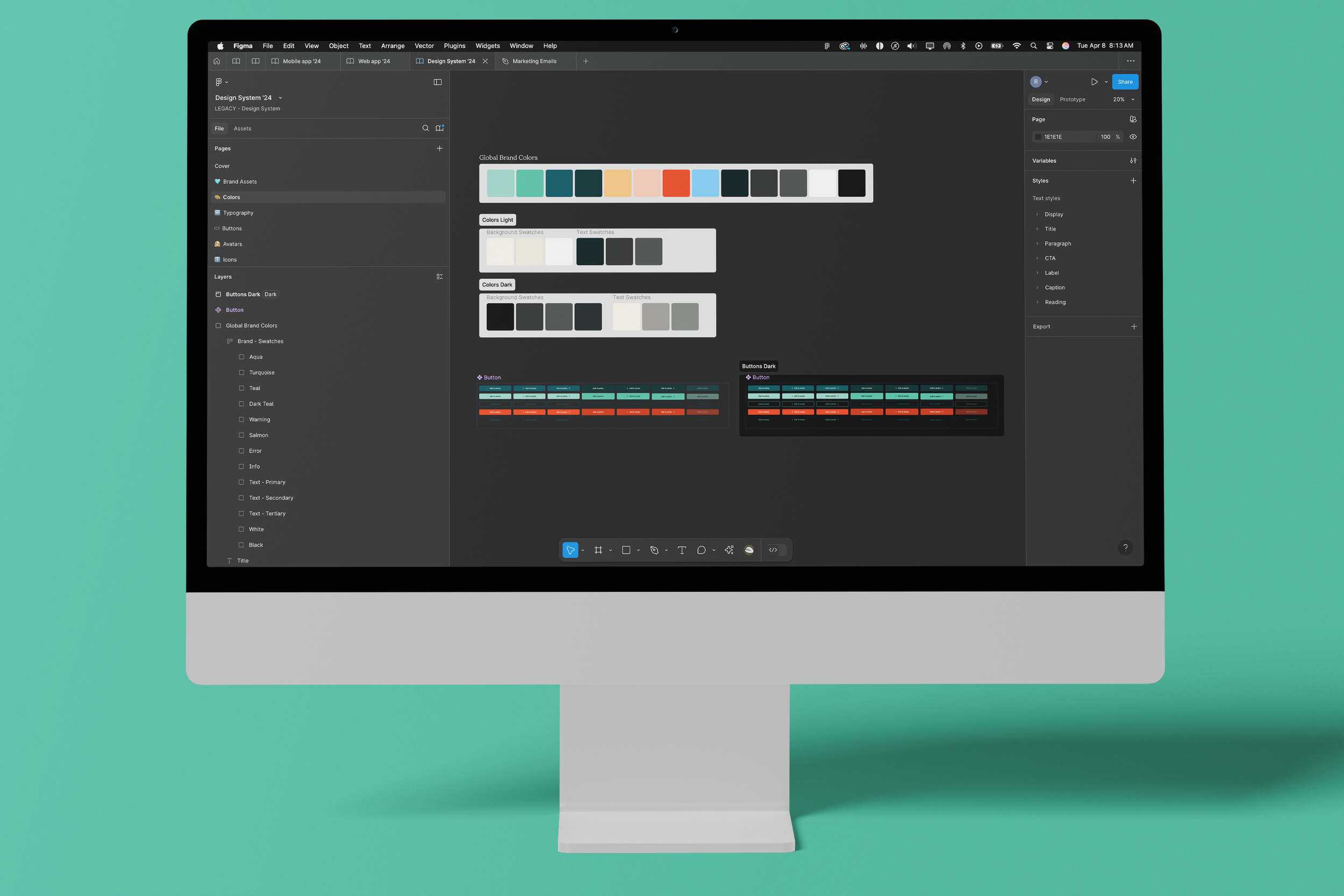
Designed a full brand system including logo, color palette, typography, and visual voice—establishing a recognizable and cohesive identity across app and web.
-
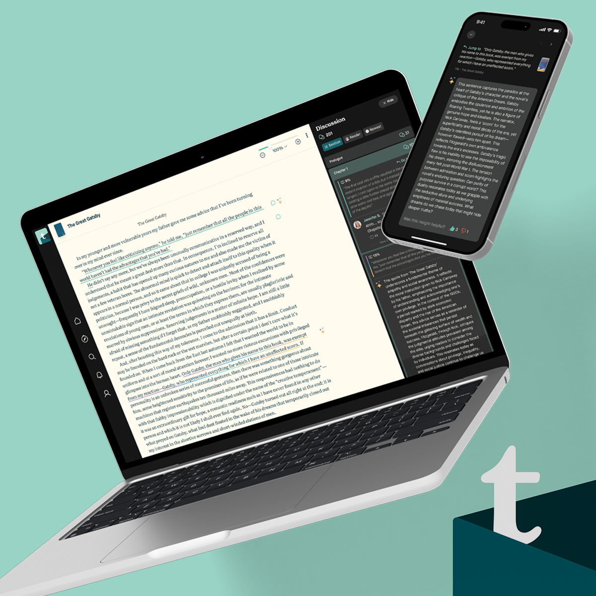
Directed UX/UI for the mobile app, creating wireframes, high-fidelity mockups, and interactive prototypes for core features like book scoring, community ratings, and reading progress tracking.
-
Conducted user interviews and feedback sessions to align design decisions with actual reader behavior and influencer needs.
-
Built and maintained a modular, scalable design system in Figma to streamline team collaboration and handoff to developers.
Establishing a Workflow
For scaling quality, I established design reviews with data—every major design decision required both peer critique and supporting user research. I also implemented cross-functional pairing where I worked directly with PM’s and engineers during discovery, preventing misalignment downstream.
The real innovation was our "design systems as documentation" approach—every component included usage guidelines and decision rationale, enabling consistent execution even as the team grew.
Listening to Our Users
As Lead Designer, I was responsible for driving a deeply user-centered approach to product development, with a strong focus on continuous discovery, validation, and iteration. I led end-to-end user research efforts—including planning and conducting user interviews, facilitating remote usability tests, and gathering behavioral data—to uncover real user needs, pain points, and expectations. I used this research to inform product decisions early and often, ensuring our design direction stayed tightly aligned with the evolving goals of our users.
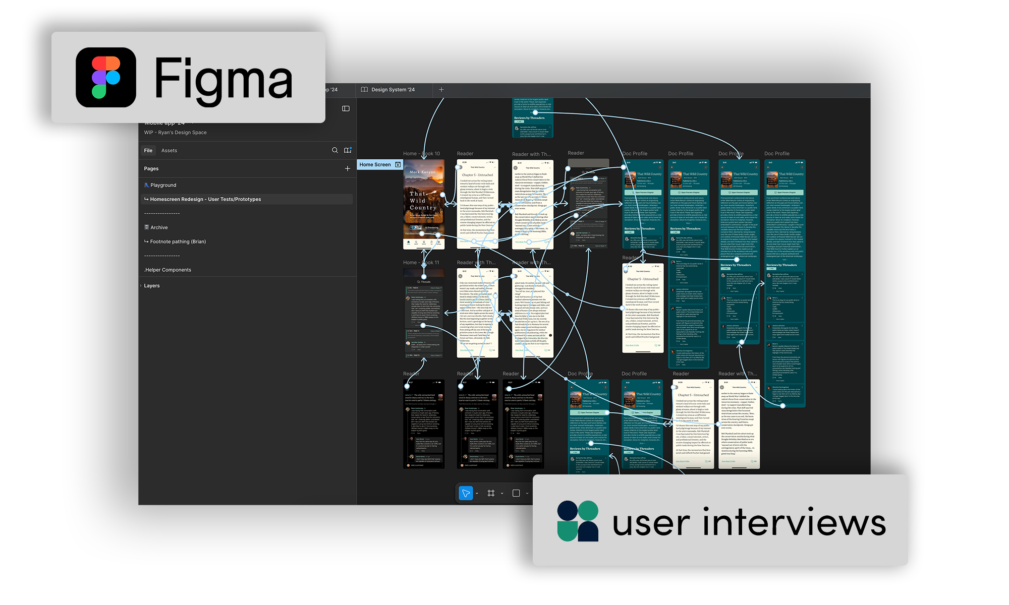
Figma was at the heart of my workflow—not just for high-fidelity UI design, but as a collaborative platform where I could build interactive prototypes, run live testing sessions, and gather feedback from stakeholders and team members in real time. I created clear, clickable prototypes to test early concepts, allowing us to validate ideas quickly and pivot before investing engineering time.
In close partnership with product managers and key stakeholders, I translated insights into well-defined user workflows, journey maps, and wireframes that clarified the end-to-end experience. These deliverables served as a shared source of truth across teams, helping to align priorities and ensure everyone was working toward a unified vision. I also worked closely with engineering to ensure our designs were feasible and scalable, and participated in regular design reviews and cross-functional planning sessions to keep momentum strong.
This research-driven, highly collaborative process led to the development of features that were not only highly usable, but deeply aligned with what our users actually wanted. As a result, we saw measurable improvements in both product adoption and user satisfaction. My work helped create a foundation of empathy and clarity that supported smarter design decisions and ultimately shaped a product that users genuinely loved engaging with.
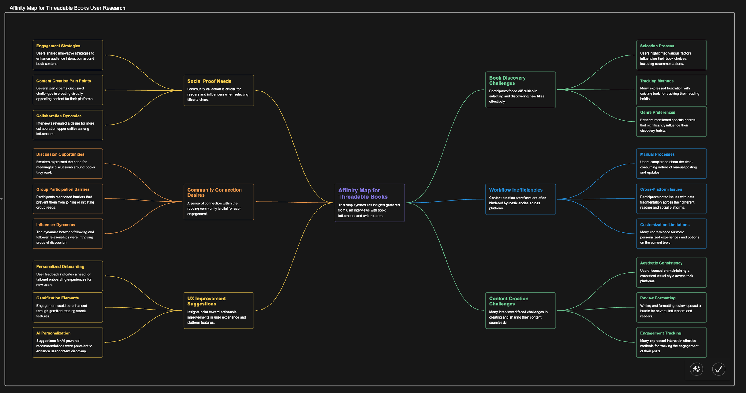
Affinity Mapping
Key Actions
Conducted comprehensive user research synthesis by clustering insights from 15+ interviews with book influencers and avid readers into six major theme categories
Identified actionable UX improvement opportunities including personalized onboarding, AI-powered recommendations, and gamification elements to address user pain points
Key Findings
Users face significant workflow inefficiencies across fragmented platforms, with major pain points in content creation processes, tracking methods, and cross-platform integration issues
Strong desire for enhanced community connection and social proof validation, with users expressing needs for meaningful discussions, collaboration opportunities, and consistent aesthetic experiences across their reading platforms
A Deeper Approach.
I initiated a comprehensive UX audit and conducted user research to understand pain points and opportunities.
Key Actions:
Performed heuristic evaluations to identify usability issues.
Conducted user interviews with diverse reader demographics.
Analyzed user behavior data to uncover engagement patterns.
Key Findings:
Users desired a more intuitive navigation structure.
Lack of community features hindered user retention.
Inconsistent branding led to confusion and reduced trust.
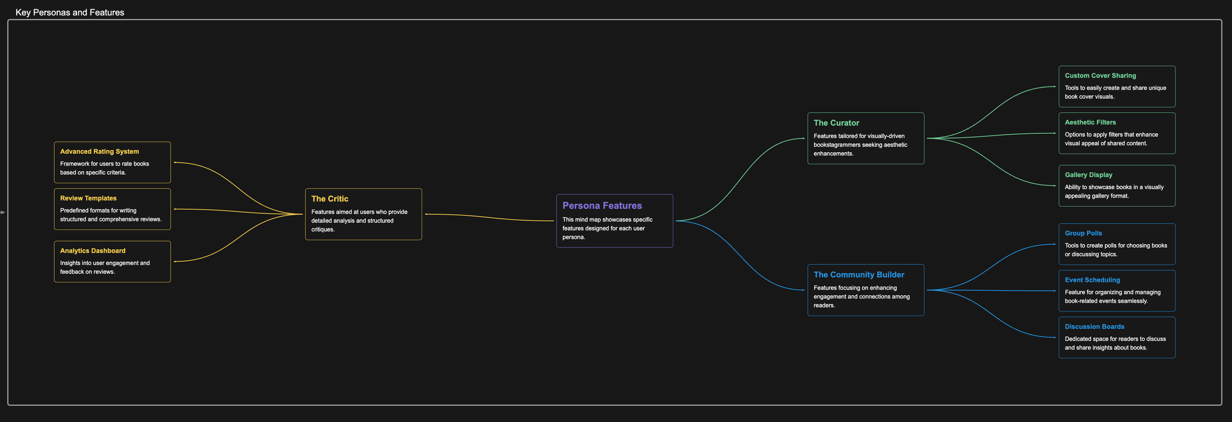
I identified three distinct user personas through research - The Curator (focused on visual content creation), The Critic (emphasizing detailed analysis), and The Community Builder (prioritizing group engagement) - then mapped specific platform features to each persona's core needs, ensuring every major feature decision was grounded in user research rather than assumptions.
Develop
I explored multiple solutions, testing wireframes and prototypes with users.
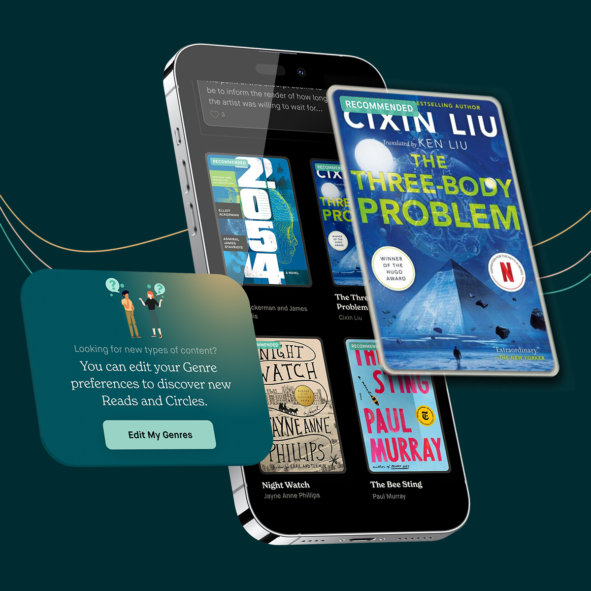
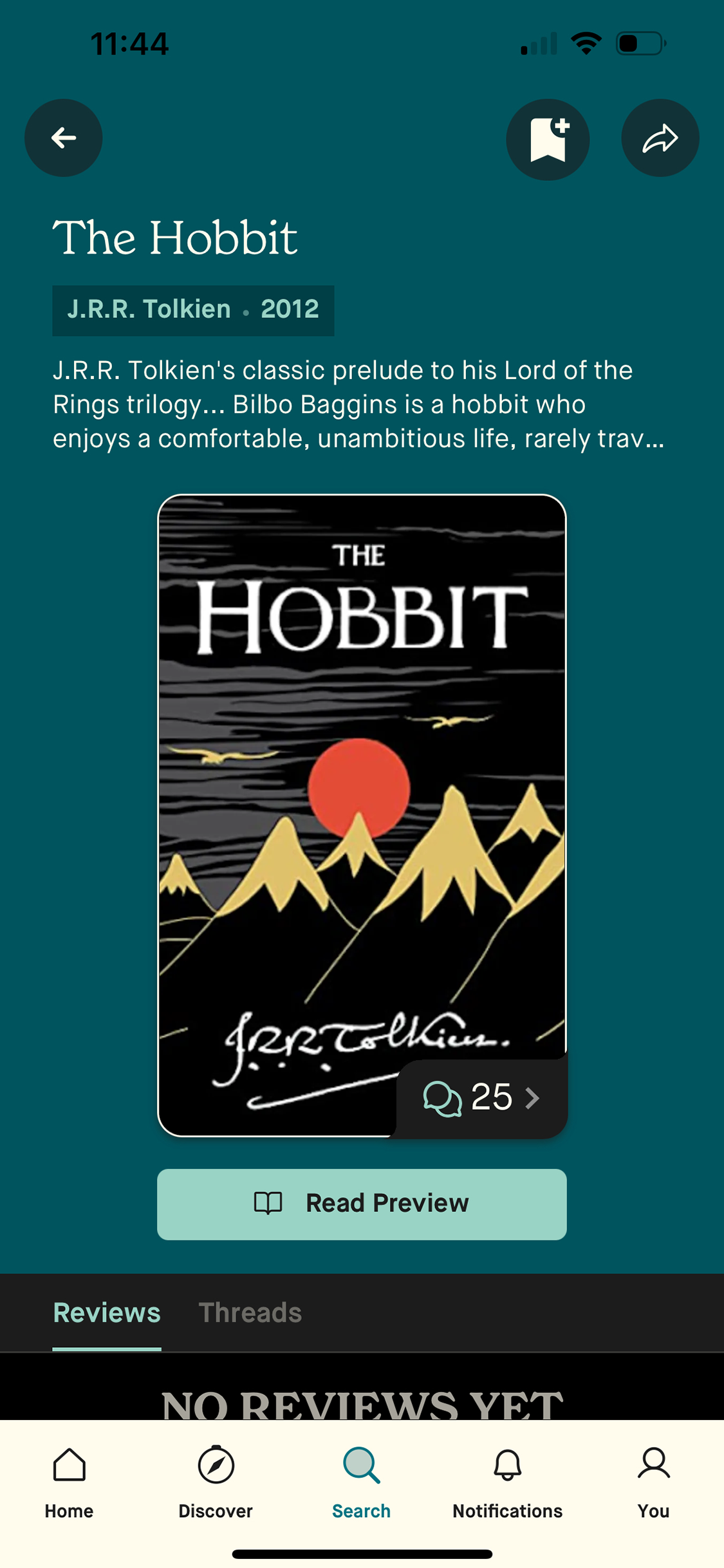
Onboarding: Reduced steps from many to three, focusing on interest selection and immediate content exposure.
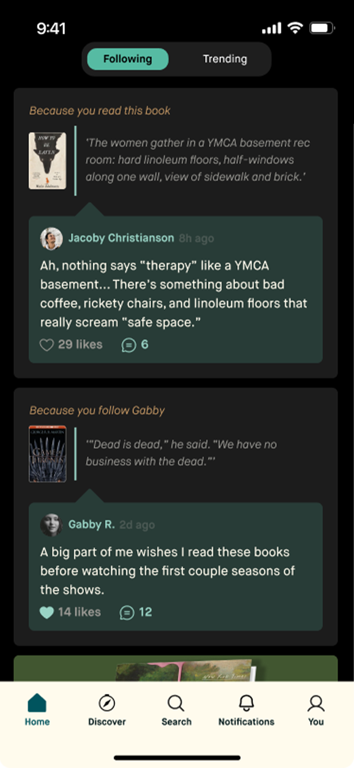
Feeds: Mixed community content with friend activity to solve the cold start problem.
Design system: Established shared components, tokens, and style guidelines for consistent cross-platform use.
Iterations based on testing:
Simplified optional profile fields to avoid confusion.
Added filters to community feeds so users could ease in gradually.
Adjusted color and typography for better legibility and consistency.
Cross-Functional Collaboration
*
Cross-Functional Collaboration *
Additionally, productive relationships with engineers has been a cornerstone of how I work. I believe great products happen when design and development are tightly aligned, so I’ve made it a priority to establish open lines of communication, early and often. From the start of a project, I collaborate closely with engineering partners to ensure that design solutions are not only user-centered but technically feasible and scalable.
I involve developers early in the design process—sharing prototypes in Figma, walking through user flows, and inviting input before finalizing decisions. This not only helps surface edge cases and opportunities for smarter solutions, but also creates a shared sense of ownership across disciplines. I’ve found that including engineers in conversations around UX and product strategy leads to better implementation and a more seamless handoff process.
During development, I stay closely engaged—answering questions, providing detailed specs, and making quick design adjustments when needed. I also work with QA to maintain the integrity of the design and ensure that what we ship reflects the original vision. Whether through regular design-engineering syncs, Slack collaboration, or design tokens tied to our system, I’ve built a reputation as a designer who respects the dev process and makes it easier to build beautiful, usable products.
Deliver
Final solution highlights:
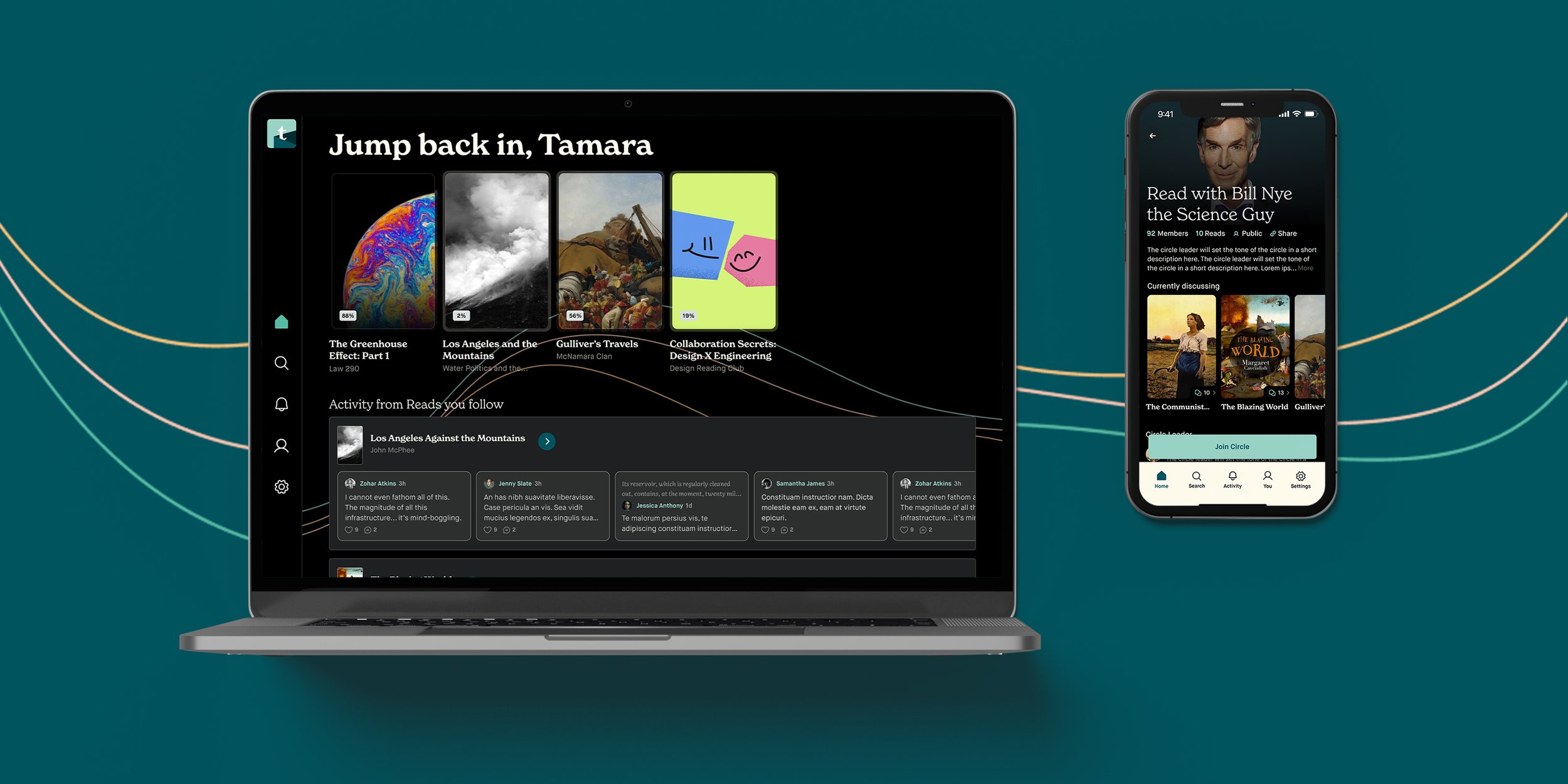
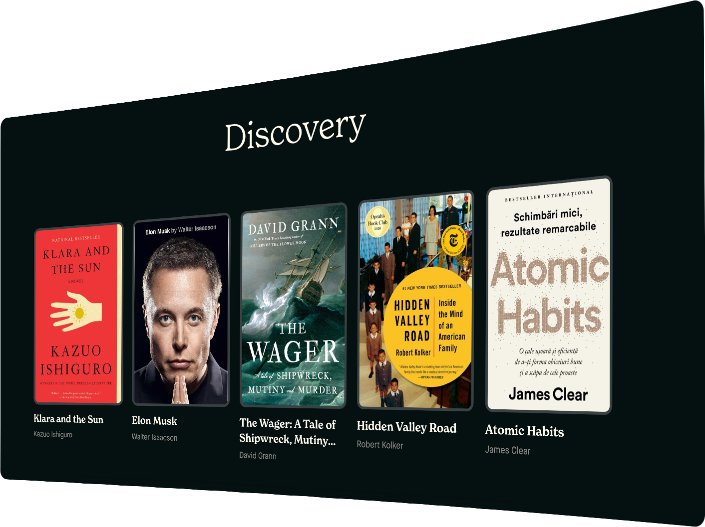
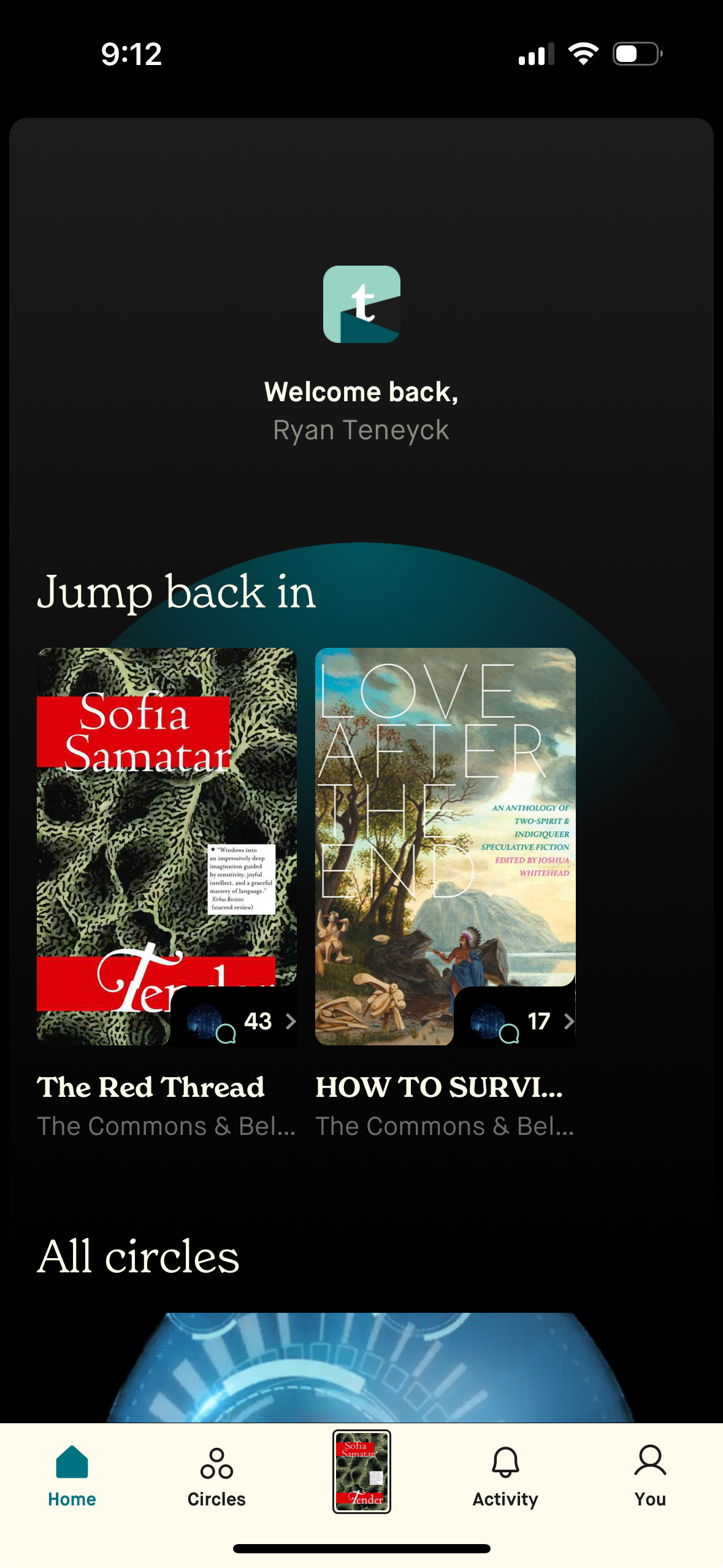
Streamlined onboarding flow that shows relevant content right away.
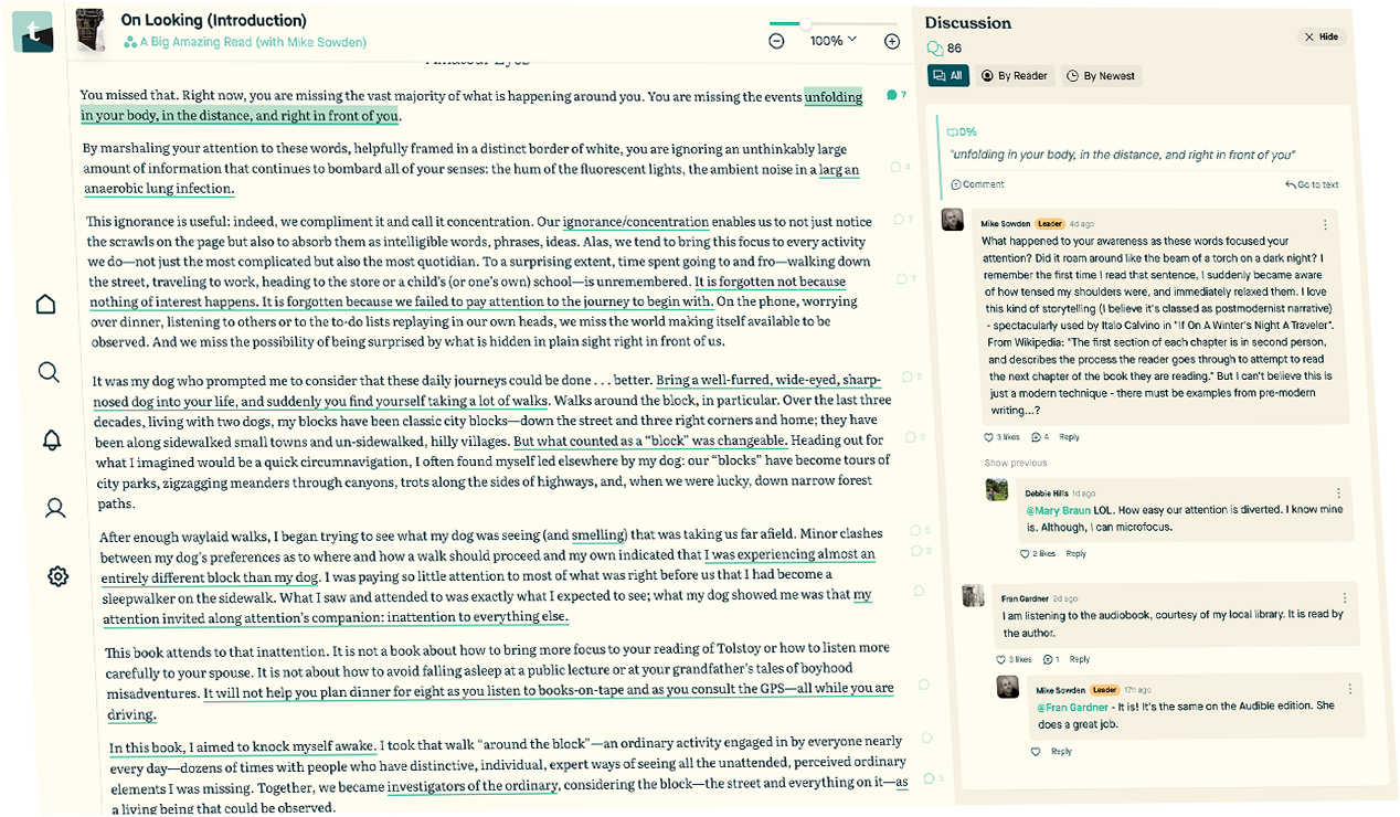
A hybrid social feed with curated community activity and “ambient social proof.”
A scalable design system with cohesive typography, color, and component standards.
Impact
+60% active users
+40% increase in overall engagement
+25% boost in retention
Book scoring completion rose by 67%
Comment engagement doubled
Retention for low-connectivity users improved by 34% with early community content
Before & After
Before & After
Reflection
This project reinforced the importance of validating social experiences for users without existing connections and the long-term value of establishing a design system early. It also highlighted the need to balance stakeholder requests with evidence from user testing.